Take Home Exercise 2
Peer critique and visualization remake of take-home exercise 1
Overview
This document critiques a classmate’s submission of Take Home Exercise 1 - which aims to produce an age-sex pyramid to analyse demographic structure of Singapore by planning area level.
Critique
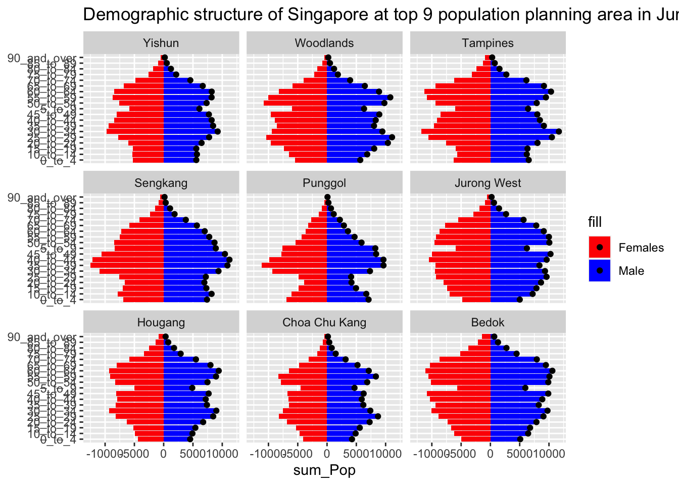
The image below is the plot submitted by a classmate; it presents the demographic structure of Singapore’s top 9 population planning area.
- Labeling of X and Y axis are clear
- There is clear labeling of each planning area
- The sequence of age are in running order
- However, there is opportunity for improvement by population size (i.e. the most populated region in top left hand corner and least populated region in bottom right hand corner)
We will attempt to incorporate this improvement in our ggplot.
Data Wrangling
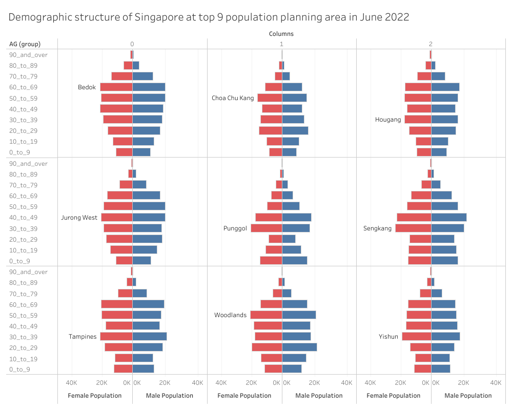
Using dplyr, some data wrangling is done to select the top 9 planning areas by population size
Visualization Remake
Using ggplot2, a remake of the submitted visualisation is done